


x

Закупете дигитално изображение с висока резолюция и подобрени характеристики, значително по-добро от онлайн прегледа.
Всеки файл е щателно подготвен от нашите специалисти с помощта на съвременни инструменти и експертна ръчна ретуш. Гарантираме, че всяко изображение има изключителна яснота, прецизна цветова точност и фини детайли.
Окончателният файл се доставя по имейл в рамките на 72 часа, оптимизиран за незабавна употреба в професионални, редакционни и печатни среди. Това е същото качество, на което се доверяват водещи дизайнерски студия, издатели и галерии.
Изтеглете файл с висока резолюция за лично показване, принтиране и творчески проекти. ( Купете принт Купете ръчно рисувана картина)
Когато изберете Most-Famous-Paintings.com, вие не получавате само изображение – вие получавате професионално подобрена дигитална творба, създадена с прецизност и подкрепена от гаранция за удовлетворение. Ето всичко, което автоматично се включва в вашата поръчка:

Вашето дигитално изображение с висока резолюция ще ви бъде изпратено по имейл в рамките на 72 часа от поръчката - готово за незабавно използване.

Вашата картина е професионално оптимизирана с помощта на усъвършенствани инструменти за изкуствен интелект и ръчна редакция, осигурявайки максимална детайлност, яснота и точност на цветовете.

Изгубили сте или сте премахнали файла си по погрешка? Не се притежнявайте – ще го изпратим отново на Вас по всяко време, безплатно.

Всредите си веднага без мита, данъци или такси по доставка - дигителните приложения винаги са без данъчно освободени.

Гарантираме, че вашето дигитално изображение отразява оригиналните цветове възможно най-точно, използвайки професионални инструменти и управление на цветовете.

Ако не сте доволни от вашето дигилно изображение, ще го коригираме или ще възмедим 100% в рамките на 60 дни – без никакви въпроси.

Не сте удовлетворени? Получавате пълно възстановяване на сумата в рамките на 60 дни след получаването на вашия цифров файл – без никакви въпроси.

Купете 3 изображения, спестете 10% - Купете 5, спестете 15% - Купете 10+, спестете 20%. Отлично за творчески проекти, галерии и агенства.
Mark Rothko's “Sacrifice,” painted in 1946, isn’t merely a canvas filled with color; it’s an immersion. The work immediately confronts the viewer with a profound sense of melancholy and quiet contemplation – a feeling that lingers long after the initial glance. Dominated by a palette of muted blues, grays, and ochres, the painting eschews sharp outlines or representational imagery, instead opting for a carefully orchestrated layering of translucent washes and subtle shifts in tone. It’s a landscape not of space, but of emotion, a visual embodiment of introspection.
Rothko's approach during this period – often referred to as his “Color Field” phase – was revolutionary. He moved away from figuration, believing that color itself could convey profound spiritual and emotional experiences. “Sacrifice,” like many works from this era, is built upon the principle of ‘all-over’ composition; every area of the canvas contributes to the overall effect, creating a sense of unity and dissolving any clear focal point. The fragmented figures, barely discernible within the washes of color, aren't portraits but rather echoes of humanity – suggestions of individuals caught in a moment of profound reflection or perhaps even sorrow.
The painting’s remarkable depth is achieved through Rothko’s masterful use of layering and glazing. He applied thin washes of color, allowing them to bleed into one another, creating a hazy, atmospheric effect. The surface isn't smooth; it retains the evidence of his process – visible brushstrokes and subtle variations in texture that add to the painting’s tactile quality. He employed a technique he called “veiling,” where layers of translucent color were applied over previous ones, subtly altering their hue and intensity. This created an illusion of depth and luminosity, as if the colors themselves were radiating light.
The choice of materials – watercolor and gouache on paper – is crucial to understanding the work’s ethereal quality. Watercolor's inherent fluidity lends itself perfectly to Rothko’s atmospheric style, while gouache provides a slightly more opaque layer, allowing him to control the intensity of color and create subtle gradations. The use of paper, rather than canvas, contributes to the painting’s intimate scale and delicate feel.
The title, “Sacrifice,” immediately invites interpretation. While Rothko rarely offered explicit explanations for his work, it's widely believed that this piece explores themes of loss, mortality, and spiritual yearning. The muted colors evoke a sense of sadness and resignation, while the fragmented figures suggest a search for meaning in a world often marked by suffering. Some art historians connect the painting to Rothko’s own personal experiences – his early losses, his displacement as a Jewish immigrant, and his lifelong struggle with existential questions.
Beyond individual interpretation, “Sacrifice” resonates on a broader level. The painting's ambiguity allows viewers to project their own emotions and experiences onto the canvas, creating a deeply personal connection. It’s a work that demands quiet contemplation, inviting us to confront our own mortality and grapple with the mysteries of existence.
“Sacrifice” stands as a pivotal example of Rothko's mature style – a testament to his ability to transform simple colors into profound expressions of human emotion. Its enduring appeal lies in its capacity to evoke a wide range of responses, from melancholy and introspection to awe and wonder. Reproductions of this work continue to captivate audiences worldwide, serving as a reminder of the power of art to transcend language and connect us to something deeper within ourselves.
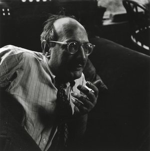
1903 - 1970 , Латвия

Бъдете информирани за последните новини в света на изкуството, ексклузивни оферти и идеи за декорация.
Разкажете ни за вашия проект и нашите експерти по изкуство ще ви предложат 3 персонализирани предложения за произведения на изкуството.
Нека подберем 3 варианта само за вас – безплатно!


 Представи си го
 Изпрати
 Сподели
 Детайли

 Изтегляне
 Подобни
 Рентгенова снимка
 Слайдшоу

 Прочетете повече


