


x

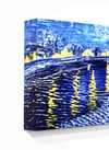
Giclée- eller lærredstryk i museumskvalitet med hurtig produktion og fleksible muligheder for finish. ( Køb håndlavet maleri Køb billede)
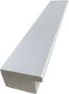

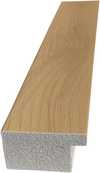
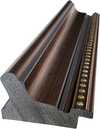
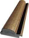
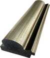
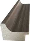
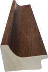
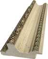
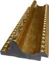
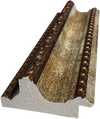
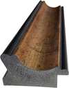
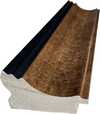
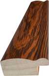
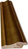
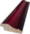
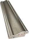
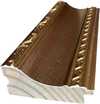
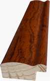
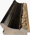
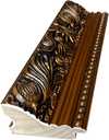
Vælg mellem vores forudindstillede størrelser, der matcher kunstværkets originale proportioner.

Du kan indtaste dine egne mål for at passe til en specifik ramme eller et bestemt område. Hvis den valgte størrelse ikke stemmer overens med det originale billedes proportioner, vil vi enten beskære kunstværket eller udvide billedet med en spejlet eller ensfarvet kant. En digital mockup vil blive sendt til din godkendelse, før produktionen påbegyndes.
Bemærk venligst, at forhåndsvisningen på skærmen ikke afspejler den faktiske beskæring eller udvidelse. Kun mockuppen vil nøjagtigt vise den endelige komposition.
Selvom specialmål er tilgængelige, anbefaler vi at vælge et mål fra den foruddefinerede liste for at bevare de originale proportioner.
Verdensomspændende levering () på 2 uger i stedet for de sædvanlige 4/5 uger. (24 august)


Contrast of form
Størrelse på reproduktion
In the heart of the early twentieth century, as the gears of industry began to turn with an unstoppable rhythm, Fernand Léger captured the very pulse of modernity in his 1914 masterpiece, "Contrast of Form." This work is far more than a mere arrangement of shapes; it is a profound visual manifesto that speaks to the tension between tradition and the burgeoning machine age. At first glance, the viewer is struck by a striking interplay of bold, primary colors—most notably a deep, commanding crimson red set against a stark, pristine white. This deliberate use of high-contrast hues does not merely decorate the canvas; it creates a rhythmic vibration that pulls the eye across the composition, mirroring the frantic yet structured energy of an era defined by rapid technological advancement.
Léger’s approach to subject matter defies the conventional boundaries of representation. While the painting utilizes elements that suggest familiar forms—a central figure reminiscent of a teddy bear, perhaps, or a collection of fragmented objects like clocks and books—these are stripped of their literal identity and reimagined through the lens of geometric abstraction. The composition is built upon a foundation of cylinders, spheres, and cubes, creating a sense of architectural stability even amidst the visual movement. This technique allows the artist to explore the relationship between mass and space, inviting the collector to contemplate how simple forms can evoke complex emotions of order and chaos.
The technical execution of "Contrast of Form" reveals Léger’s mastery over the alla prima method. By applying layers of pigment directly onto the canvas without the heavy reliance on extensive underpainting, he achieved a luminous, textural richness that gives the flat shapes a surprising sense of weight and presence. Each brushstroke serves a purpose, contributing to a surface that feels alive with kinetic energy. This tactile quality is essential for anyone looking to integrate such a piece into a contemporary interior; the painting possesses a physical depth that commands attention under varying light conditions, making it a centerpiece capable of anchoring a room's aesthetic.
Historically, this work serves as a window into the anxieties and excitements of 1914. As Europe stood on the precipice of the First World War, Léger sought to find beauty in the mechanical and the industrial, transforming the coldness of machinery into a poetic language of form. For the discerning art lover or interior designer, this piece offers a unique opportunity to possess a fragment of history. It is an invitation to celebrate the strength of structure and the beauty of contrast, providing a sophisticated focal point that bridges the gap between historical significance and modern, avant-garde elegance.

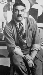
1881 - 1955 , Frankrig

Explore the profound impact of Minimalism and Geometric Abstraction. From Mondrian to Malevich, discover how stripping art to its essential forms revolutionized modern aesthetics through our expert-led historical guide.

Hold dig opdateret med de seneste kunstnyheder, eksklusive tilbud og indretningsideer.
Fortæl os om dit projekt, og vores kunsteksperter vil give dig 3 personlige kunstforslag.
Vi kuraterer 3 valgmuligheder kun til dig – Gratis!


 Se i fuld skala
 Del
Del Del
Del
 Detaljer

 Download
 Lignende værker
 Røntgenundersøgelse
 Diasshow

 Se mere
 Glasmulighed er kun tilgængelig i størrelser under 110 cm


