
The Foundations of Color Psychology: Historical Context & Neurological Basis
 Wikipedia: Color psychology
Color psychology is the study of colors and hues as a determinant of human behavior. Color influences perceptions that are not obvious, such as the taste of food. Colors have qualities that may cause certain emotions in people. How color influences i...
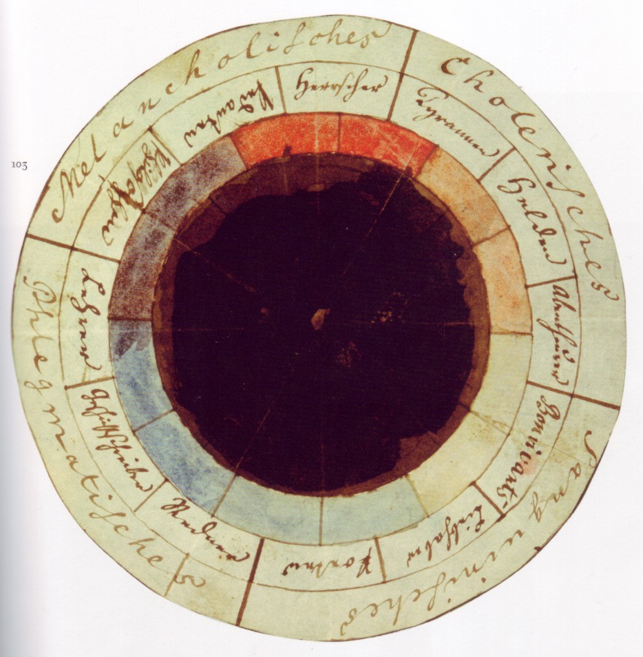
For millennia, humanity has been captivated by color—not merely as a visual phenomenon, but as a force imbued with meaning and power. From the ochre pigments adorning prehistoric cave paintings to the vibrant frescoes of the Renaissance, color has served as a conduit for storytelling, ritual, and emotional expression. However, the systematic study of color’s influence on the human psyche is a relatively recent endeavor. While ancient civilizations like Egypt employed colored rooms for therapeutic purposes – documented as early as 2000 BC – it wasn't until the 18th and 19th centuries that thinkers began to explore the psychological dimensions of hue. Johann Wolfgang von Goethe’s *Theory of Colors* (1810), though often criticized for its subjective approach, laid crucial groundwork by linking colors to specific emotional states: yellow as “serene,” blue as a blend of “excitement and repose.” This intuitive understanding paved the way for more rigorous investigation.
The early 20th century witnessed pivotal contributions from figures like Carl Jung, who posited that “colors are the mother tongue of the subconscious.” Jung’s exploration of color symbolism in art, mandalas, and alchemy revealed a universal language embedded within our collective unconscious. Simultaneously, German neurologist Kurt Goldstein conducted experiments attempting to correlate colors with physiological responses – though his findings proved difficult to replicate, they spurred further research into the biological effects of color exposure. Modern neuroscience now confirms that color perception is far from a passive process; it triggers complex activity in the brain’s limbic system—the seat of emotions—and influences hormonal balance and even heart rate. The very act of seeing color activates neural pathways associated with memory, association, and subjective experience.
Warm vs. Cool Tones: Decoding Emotional Responses in Interior Spaces
The fundamental dichotomy of warm and cool colors forms the bedrock of interior design’s emotional palette. Warm hues – reds, oranges, and yellows – are inherently stimulating, evoking feelings of energy, passion, and excitement. Rooted in associations with fire, sunlight, and warmth, these tones tend to advance visually, creating a sense of intimacy and enclosure. A living room bathed in shades of terracotta or ochre can foster lively conversation and social interaction, while a vibrant red accent wall might inject dynamism into a workspace. However, an overabundance of warm colors can be overwhelming, leading to restlessness or even anxiety. Balancing these potent tones with cooler counterparts is essential.
Cool colors – blues, greens, and purples – conversely promote tranquility, relaxation, and serenity. Linked to the natural world—the ocean, forests, and sky—they recede visually, expanding space and fostering a sense of calm. Bedrooms often benefit from cool palettes, encouraging restful sleep and peaceful contemplation. Greens, in particular, are associated with balance and renewal, making them ideal for spaces dedicated to wellness or meditation. Yet, relying solely on cool tones can create a detached or cold atmosphere; introducing warmer accents—perhaps through textiles or artwork—can prevent the space from feeling sterile. The interplay between warm and cool is not merely aesthetic but fundamentally psychological.
Beyond Hue: Saturation, Value, and the Nuances of Color Perception
While hue (the pure color itself – red, blue, green) receives much attention, saturation and value are equally crucial determinants of emotional response. Saturation refers to the intensity or purity of a color; highly saturated colors are vivid and energetic, while desaturated colors appear muted and subdued. A bright, saturated crimson evokes passion and excitement, whereas a dusty rose conveys tenderness and nostalgia. Value, conversely, describes the lightness or darkness of a color. High-value colors (light shades) feel airy and expansive, while low-value colors (dark shades) create intimacy and drama.
The skillful manipulation of saturation and value allows designers to fine-tune the emotional impact of a space. For instance, a pale lavender with low saturation can induce a sense of calm and serenity in a bedroom, whereas a deep indigo with high saturation might evoke sophistication and mystery in a study. Understanding these nuances is paramount; a seemingly minor shift in value or saturation can dramatically alter the perceived mood. Moreover, texture plays a vital role—matte surfaces absorb light, creating a softer, more subdued effect, while glossy surfaces reflect light, enhancing vibrancy and energy.
Cultural Significance of Color: Global Variations & Design Considerations
Color associations are not universal; they are deeply rooted in cultural context. What is considered auspicious in one society may be perceived as somber or even taboo in another. In many Eastern cultures, red symbolizes good luck, prosperity, and celebration—often used in weddings and festivals. Conversely, in Western societies, red can signify passion, danger, or aggression. White, often associated with purity and innocence in the West, is traditionally linked to mourning and death in some Asian cultures. Ignoring these cultural nuances can lead to unintended consequences in design.
A sensitive designer considers the target audience’s cultural background when selecting color palettes. For example, a hotel catering to international clientele might opt for neutral tones with subtle accents that avoid potentially offensive or misinterpreted associations. Similarly, branding projects must carefully consider the cultural implications of color choices to ensure effective communication and resonance. Researching local traditions and symbolism is crucial—a seemingly innocuous color can carry profound meaning within a specific context.
Optimizing Productivity with Strategic Color Palettes: Offices, Workspaces & Focus Areas
The impact of color extends beyond emotional well-being; it also influences cognitive function and productivity. In office environments, strategic color palettes can enhance focus, creativity, and collaboration. Blues and greens are often favored for their calming effects, promoting concentration and reducing stress. However, an overly cool environment can stifle innovation; introducing warmer accents—such as yellows or oranges—can stimulate creative thinking and problem-solving.
Studies suggest that certain shades of blue enhance cognitive performance, while greens promote a sense of balance and clarity. Incorporating biophilic design elements – colors inspired by nature – can further boost productivity and well-being. Breakout spaces might benefit from warmer tones to encourage social interaction, while individual workstations could prioritize cooler hues for focused work. The key is to create a dynamic environment that caters to diverse needs and tasks.
Creating Ambiance: Color’s Role in Relaxation, Socialization & Sensory Experience
Ultimately, color's power lies in its ability to shape ambiance—the overall feeling or atmosphere of a space. A well-designed room transcends mere functionality; it evokes emotions, stimulates memories, and enhances sensory experience. Bedrooms, dedicated to relaxation and rejuvenation, often benefit from soft, muted palettes – lavenders, pale blues, and gentle greens – promoting tranquility and restful sleep. Dining rooms, intended for socialization and connection, might embrace warmer tones—terracottas, ochres, and deep reds—fostering lively conversation and intimacy.
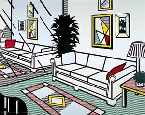
The art of creating ambiance involves a holistic approach, considering not only color but also lighting, texture, and spatial arrangement. Layering colors – incorporating different shades and tones within a cohesive palette – adds depth and complexity to the space. Artwork plays a crucial role—a carefully chosen painting can complement the overall color scheme and evoke specific emotions. At Most-Famous-Paintings.com, we offer an extensive collection of hand-painted reproductions and custom artwork, allowing you to curate a space that reflects your unique vision and enhances your well-being. Our expert consultants are available to guide you through the process, ensuring that every detail contributes to a harmonious and emotionally resonant environment.