


The Psychology of Color in Interior Design
For millennia, humanity has been captivated by color – not merely as a visual phenomenon, but as a powerful force shaping our emotions and perceptions. From the ochre pigments adorning prehistoric cave paintings to the vibrant hues of Renaissance masterpieces, color has always held symbolic weight, communicating meaning far beyond mere aesthetics. This inherent connection between color and the human psyche forms the bedrock of what we now understand as color psychology, a field increasingly vital for those shaping our built environments. The very act of selecting a shade is not simply an aesthetic choice; it’s a deliberate manipulation of mood, atmosphere, and even behavior within a space.
Early explorations into this realm can be traced back to figures like Johann Wolfgang von Goethe, whose 1810 “Theory of Colors” moved beyond the scientific analysis of light refraction undertaken by Isaac Newton. Goethe posited that color wasn’t simply a physical property but an active force influencing our emotional state. He observed how certain colors evoked feelings of warmth and energy (reds and oranges), while others inspired tranquility and contemplation (blues and greens). This intuitive understanding, refined over centuries through artistic practice and psychological study, now informs the work of interior designers seeking to create spaces that resonate with their inhabitants.
Consider the impact of red. Often associated with passion, energy, and even danger, it can stimulate conversation and excitement – making it a bold choice for dining rooms or entryways. However, its intensity demands careful consideration; overuse can lead to feelings of agitation or overwhelm. Conversely, blue, frequently linked to serenity, trust, and stability, is ideal for bedrooms and bathrooms, fostering relaxation and peacefulness. The nuance lies in understanding not just the inherent qualities of a color but also how those qualities interact with light, texture, and surrounding hues.
Building Effective Color Palettes: Principles & Tools
Creating a harmonious color palette isn’t about randomly selecting pleasing shades; it's an exercise in balance, contrast, and intentionality. A foundational understanding of color theory is essential. The color wheel, a visual representation of color relationships, provides a roadmap for constructing effective schemes. Complementary colors – those opposite each other on the wheel (e.g., blue and orange) – create high contrast and vibrancy, ideal for accentuating specific features. Analogous colors – those adjacent to each other (e.g., blue, blue-green, green) – offer a more harmonious and soothing effect.
Beyond these basic relationships, designers often employ techniques like triadic schemes (using three equally spaced colors on the wheel) or tetradic schemes (utilizing four colors in two complementary pairs). However, mastering these principles requires an understanding of value (lightness or darkness), saturation (intensity), and tone (the addition of gray). A muted palette, for example, might employ low-saturation versions of analogous colors to create a calming atmosphere, while a high-saturation scheme could utilize bold complementary colors for a more dynamic effect.
Digital tools have revolutionized the process of palette creation. Numerous online platforms allow designers to experiment with different color combinations, visualize them in virtual room settings, and even extract palettes from existing images. These resources are invaluable for quickly iterating through ideas and presenting options to clients. However, it’s crucial to remember that technology is merely a tool; the true artistry lies in understanding how colors interact and evoke specific emotions.
Color Schemes by Room: Practical Applications for Freelance Decorators
The application of color psychology varies significantly depending on the intended function of a space. A bedroom, designed as a sanctuary for rest and rejuvenation, demands a different approach than a home office, which should foster focus and productivity. For bedrooms, soft blues, lavender hues, and muted greens are often preferred, promoting relaxation and sleep. Avoiding overly stimulating colors like bright red or orange is generally advisable.
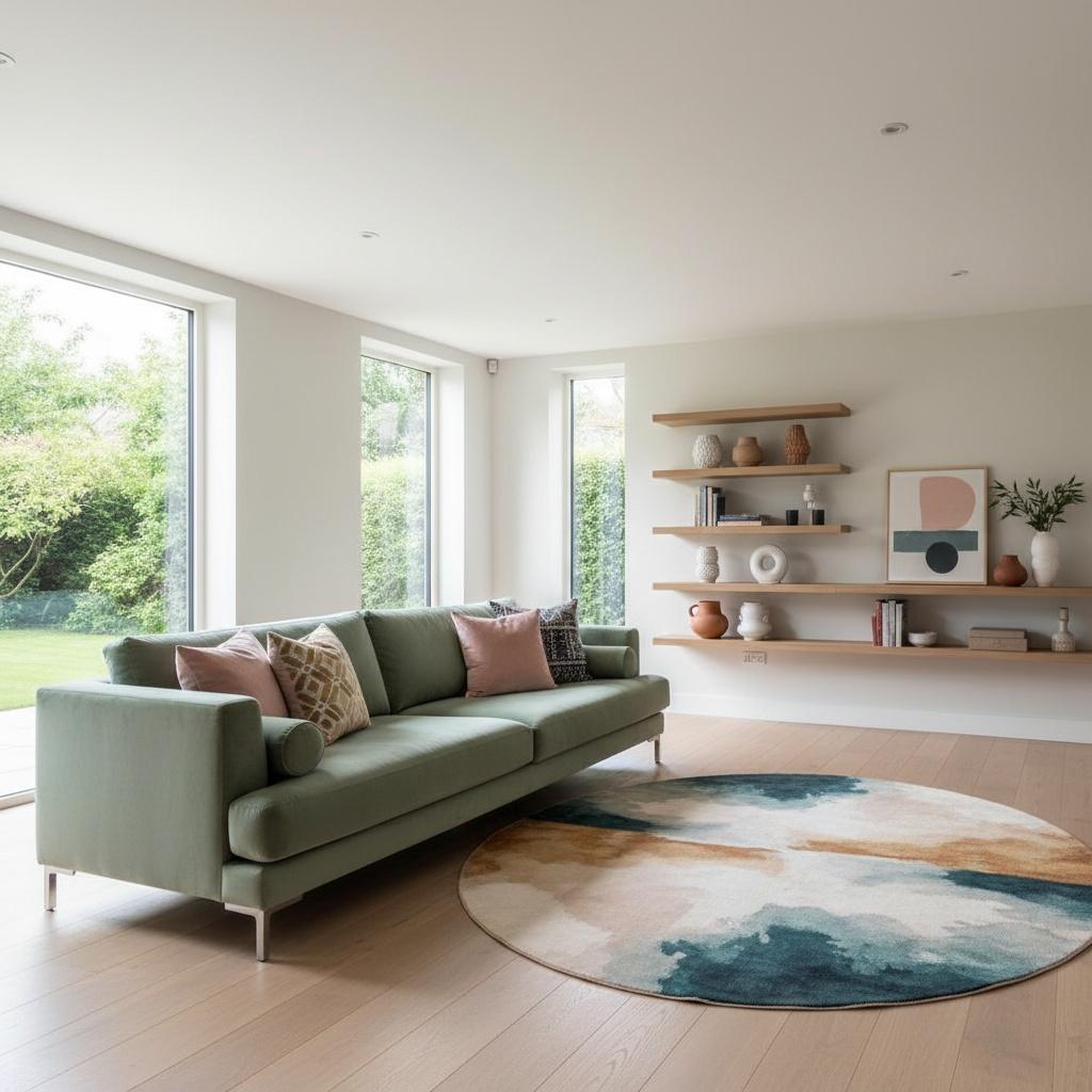
Living rooms, as spaces for social interaction and relaxation, offer more flexibility. Warm neutrals paired with accent colors can create a welcoming atmosphere. Consider incorporating shades of gray, beige, or cream as a base, then adding pops of color through artwork, textiles, and accessories. Kitchens, often the heart of the home, benefit from colors that stimulate appetite and conversation. Yellows, oranges, and reds can create an inviting atmosphere, while blues and greens offer a cooler, more refreshing feel.
Home offices require careful consideration of color’s impact on concentration. Blues and greens are again excellent choices, promoting focus and clarity. However, avoid overly dark or drab colors, which can lead to feelings of lethargy. A touch of warm accent color – such as a muted orange or yellow – can provide a subtle energy boost without being distracting. Bathrooms, intended for relaxation and self-care, benefit from calming blues, greens, and soft whites.
Trends in Interior Design Color and How to Leverage Them
While timeless principles of color psychology remain constant, trends in interior design are constantly evolving. Currently, we’re seeing a move towards warmer neutrals – think terracotta, ochre, and creamy beiges – replacing the cooler grays that dominated for so long. These earth tones evoke a sense of grounding and connection to nature, reflecting a growing desire for authenticity and well-being.
Another prominent trend is the use of jewel tones – rich emerald greens, sapphire blues, and ruby reds – as accent colors. These luxurious hues add depth and sophistication to any space, creating a sense of opulence and drama. Biophilic design, which emphasizes incorporating natural elements into interior spaces, is also influencing color choices. Greens, browns, and earthy tones are increasingly popular, blurring the lines between indoors and outdoors.
As a freelance decorator, staying abreast of these trends is crucial for attracting clients and delivering contemporary designs. However, it’s equally important to avoid blindly following fads. The most successful designs seamlessly blend current trends with timeless principles, creating spaces that are both stylish and enduring. Understanding your client's preferences and lifestyle is paramount; a trend that works beautifully in one home may be entirely inappropriate for another.
Client Communication & Color Selection: A Professional Approach
Effective communication is the cornerstone of any successful design project. When discussing color with clients, avoid technical jargon and instead focus on evoking emotions and creating a shared vision. Instead of simply stating “we’ll use a complementary color scheme,” describe how that combination will create a sense of energy and vibrancy in the room.
Presenting color palettes visually is essential. Utilize mood boards, paint swatches, and digital renderings to help clients visualize the final result. Encourage them to share their preferences – what colors make them feel happy, relaxed, or inspired? Actively listen to their feedback and be willing to adjust your recommendations accordingly.
- Offer curated palettes: Present a few carefully selected options rather than overwhelming clients with endless choices.
- Explain the rationale behind each choice: Articulate how the colors align with their desired mood and lifestyle.
- Provide samples: Allow clients to see the colors in their own space, under different lighting conditions.
- Be open to compromise: Remember that it’s their home, and ultimately, they need to love the final result.
By combining a deep understanding of color psychology with effective communication skills, freelance decorators can create spaces that are not only aesthetically pleasing but also profoundly impactful – transforming houses into homes and enhancing the lives of those who inhabit them.