


x

Osta korkearesoluutioinen, parannettu digitaalikuva, joka on laadultaan huomattavasti parempi kuin verkkosivuston esikatselu.
Jokainen tiedosto valmistellaan huolellisesti omien asiantuntijoidemme toimesta käyttäen edistyneitä työkaluja ja ammattitaitoista manuaalista retusointia. Varmistamme, että jokaisessa kuvassa on poikkeuksellinen selkeys, tarkka värintoisto ja hienovaraiset yksityiskohdat.
Lopputiedosto toimitetaan sähköpostitse 72 tunnin kuluessa, ja se on optimoitu välittömään käyttöön ammattimaisissa, toimituksellisissa ja painoympäristöissä. Laatu on sama, johon huipputason suunnittelustudiot, kustantajat ja galleriat luottavat.
Lataa korkearesoluutioinen tiedosto henkilökohtaiseen näyttelyyn, tulostamiseen ja luoviin projekteihin. ( Osta printti Osta käsintehty maalaus)
Kun valitset Most-Famous-Paintings.com-palvelun, et saa vain kuvaa – saat ammattimaisesti parannetun digitaalisen taideteoksen, joka on luotu tarkkuudella ja jonka takaa tulee tyytyväisyystakuu. Tässä on kaikki, mitä tilauksesi sisältää, automaattisesti:

Korkearesoluutioinen digitaalinen kuvatiedostosi lähetetään sähköpostiisi 72 tunnin kuluessa tilauksesta – valmiina käytettäväksi välittömästi.

Taiteilijasi teos on optimoitu ammattimaisesti edistyneiden tekoälytyökalujen ja manuaalisen muokkauksen avulla, mikä takaa maksimaalisen yksityiskohtaisuuden, selkeyden ja väritarkkuuden.

Oletko vahingossa poistanut tai kadottanut tiedostosi? Ei hätää – lähetämme sen sinulle uudelleen milloin tahansa täysin maksutta.

Nauti taiteestasi välittömästi ilman tulleja, veroja tai toimitusmaksuja – digitaaliset lataukset ovat aina verovapaita.

Varmistamme, että digitaalinen kuvasi vastaa alkuperäisiä värejä mahdollisimman tarkasti käyttämällä ammattilaistason työkaluja ja värinhallintaa.

Jos et ole tyytyväinen digitaaliseen kuvaasi, muokkaamme sitä tai palautamme 100% takaisin 60 päivän kuluessa – ilman kysymyksiä.

Etkö ole tyytyväinen? Saat täyden hyvityksen 60 päivän kuluessa digitaalisen tiedostosi vastaanottamisesta – ilman kyselyitä.

Osta 3 kuvaa, säästä 10% - Osta 5, säästä 15% - Osta 10+, säästä 20%. Erinomainen valinta luoviin projekteihin, gallerioille ja toimistoille.
Mark Rothko's “Sacrifice,” painted in 1946, isn’t merely a canvas filled with color; it’s an immersion. The work immediately confronts the viewer with a profound sense of melancholy and quiet contemplation – a feeling that lingers long after the initial glance. Dominated by a palette of muted blues, grays, and ochres, the painting eschews sharp outlines or representational imagery, instead opting for a carefully orchestrated layering of translucent washes and subtle shifts in tone. It’s a landscape not of space, but of emotion, a visual embodiment of introspection.
Rothko's approach during this period – often referred to as his “Color Field” phase – was revolutionary. He moved away from figuration, believing that color itself could convey profound spiritual and emotional experiences. “Sacrifice,” like many works from this era, is built upon the principle of ‘all-over’ composition; every area of the canvas contributes to the overall effect, creating a sense of unity and dissolving any clear focal point. The fragmented figures, barely discernible within the washes of color, aren't portraits but rather echoes of humanity – suggestions of individuals caught in a moment of profound reflection or perhaps even sorrow.
The painting’s remarkable depth is achieved through Rothko’s masterful use of layering and glazing. He applied thin washes of color, allowing them to bleed into one another, creating a hazy, atmospheric effect. The surface isn't smooth; it retains the evidence of his process – visible brushstrokes and subtle variations in texture that add to the painting’s tactile quality. He employed a technique he called “veiling,” where layers of translucent color were applied over previous ones, subtly altering their hue and intensity. This created an illusion of depth and luminosity, as if the colors themselves were radiating light.
The choice of materials – watercolor and gouache on paper – is crucial to understanding the work’s ethereal quality. Watercolor's inherent fluidity lends itself perfectly to Rothko’s atmospheric style, while gouache provides a slightly more opaque layer, allowing him to control the intensity of color and create subtle gradations. The use of paper, rather than canvas, contributes to the painting’s intimate scale and delicate feel.
The title, “Sacrifice,” immediately invites interpretation. While Rothko rarely offered explicit explanations for his work, it's widely believed that this piece explores themes of loss, mortality, and spiritual yearning. The muted colors evoke a sense of sadness and resignation, while the fragmented figures suggest a search for meaning in a world often marked by suffering. Some art historians connect the painting to Rothko’s own personal experiences – his early losses, his displacement as a Jewish immigrant, and his lifelong struggle with existential questions.
Beyond individual interpretation, “Sacrifice” resonates on a broader level. The painting's ambiguity allows viewers to project their own emotions and experiences onto the canvas, creating a deeply personal connection. It’s a work that demands quiet contemplation, inviting us to confront our own mortality and grapple with the mysteries of existence.
“Sacrifice” stands as a pivotal example of Rothko's mature style – a testament to his ability to transform simple colors into profound expressions of human emotion. Its enduring appeal lies in its capacity to evoke a wide range of responses, from melancholy and introspection to awe and wonder. Reproductions of this work continue to captivate audiences worldwide, serving as a reminder of the power of art to transcend language and connect us to something deeper within ourselves.
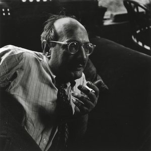
1903 - 1970 , Latvia

Pysy ajan tasalla uusimmista taideuutisista, eksklusiivisista tarjouksista ja sisustusideoista.
Kerro meille projektistasi, niin taideasiantuntijamme tarjoavat sinulle kolme henkilökohtaista taidesuositusta.
Anna meidän kuratoida 3 vaihtoehtoa juuri sinulle – Ilmaiseksi!


 Esikatselu
 Jaa
Jaa Jaa
Jaa
 Tarkemmat tiedot

 Lataa
Lataa
 Samanlaisia
 Röntgenkuva
 Diaesitys

 Näytä lisää


