

x
빠른 제작과 다양한 마감 옵션을 제공하는 박물관 품질의 지클레이 또는 캔버스 프린트. ( 손으로 그린 그림 구매 이미지 구매)

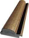

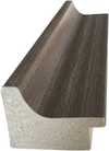
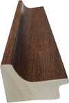
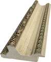

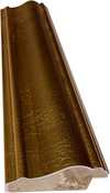
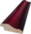
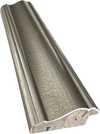
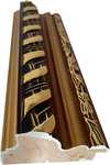

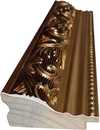
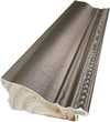
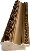
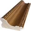
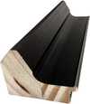
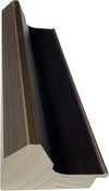
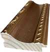
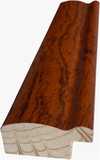
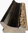
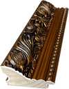
작품의 원본 비율을 유지하는 미리 설정된 크기 중에서 선택하세요.

특정 프레임이나 공간에 맞춰 직접 치수를 입력하실 수 있습니다. 선택하신 사이즈가 원본 이미지의 비율과 일치하지 않을 경우, 작품을 크롭(자르기)하거나 이미지를 대칭 또는 단색 채우기로 확장하여 제작합니다. 제작 시작 전, 최종 확인을 위해 디지털 목업이 전송됩니다.
화면상의 미리보기는 실제 크롭이나 확장 상태를 반영하지 않으므로, 최종 구도는 오직 목업을 통해서만 정확하게 확인하실 수 있습니다.
맞춤 사이즈 제작도 가능하지만, 원본 비율을 유지하기 위해서는 사전 정의된 목록에서 치수를 선택하시는 것을 권장합니다.

Coca-Cola (3)
복제본 크기
In the vast landscape of twentieth-century art, few images possess the immediate, visceral recognition of Andy Warhol’s Coca-Cola (3). Created in 1962, this work is far more than a mere depiction of a carbonated beverage; it is a profound distillation of Pop Art’s most essential tenets. Through his masterful use of screen printing, Warhol invites us to pause and reconsider the objects that populate our daily lives. By elevating a mass-produced commodity to the status of fine art, he bridges the gap between the supermarket shelf and the museum gallery, challenging the viewer to find beauty in the ubiquitous and the mundane.
The artwork presents a striking, monochromatic vision that departs from the vibrant, sugary expectations of Coca-Cola advertising. Rendered in a sophisticated palette of black, white, and nuanced shades of gray, the composition achieves a stark, graphic intensity. The iconic bottle is positioned with a deliberate, slight off-kilter tilt, creating a dynamic tension within the frame. This placement allows for a generous expanse of white space, a technique that lends the piece an airy, modern elegance. The graceful curve of the legendary script floats above the vessel, while the meticulous rendering of the label text serves as a tribute to the precision of commercial branding.
To understand the soul of Coca-Cola (3), one must look closely at the method of its creation. Warhol famously embraced the screen printing process, a technique rooted in mechanical reproduction rather than the traditional, expressive brushwork of the past. This choice was deeply symbolic; by utilizing a method that mirrors industrial manufacturing, Warhol effectively removed the "hand of the artist" from the foreground, mirroring the very mass production he sought to depict. The resulting texture is subtly complex, featuring faint dots and bands of ink that reveal the mechanical nature of the print.
For the discerning collector or interior designer, this technique offers a unique aesthetic versatility. The flat, even lighting and clean lines of the composition provide a sense of structured calm, making it an ideal centerpiece for modern, minimalist, or industrial-inspired interiors. It possesses a graphic clarity that commands attention without overwhelming a room, acting as a sophisticated nod to mid-century Americana while maintaining a timeless, avant-garde edge.
Beyond its visual allure, the piece serves as a poignant historical document of the post-war era. The early 1960s were defined by an unprecedented boom in consumerism, a period where advertising began to shape the collective cultural consciousness. Warhol’s fascination with repetition and branding captures the zeitgeist of an age obsessed with availability and uniformity. There is a certain democratic beauty in his subject matter; as he famously noted, a Coca-Cola tastes the same whether consumed by a pauper or a president.
The emotional impact of Coca-Cola (3) lies in this very sense of detachment and cool observation. The monochrome palette strips away the sensory distractions of color, leaving us with the pure, iconic form. It evokes a sense of nostalgia for a burgeoning modern age while simultaneously acting as a critique of the automation and commercialization that defined it. For those seeking to adorn their spaces with art that sparks conversation and reflects a deep understanding of cultural history, this reproduction offers an unparalleled opportunity to own a fragment of the Pop Art revolution.
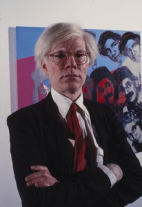
1928 - 1987 , 미국

Uncover the soul of monochrome. Explore 10 legendary black and white photography masterpieces that redefined art history. From iconic techniques to timeless stories, find museum-quality reproductions for inspired home decor. Discover all masterpieces on Most-Famous-Paintings.com

Step into the vibrant world of Pop Art. From Warhol’s bold icons to Lichtenstein’s graphic brilliance, discover the stories behind 10 legendary masterpieces. Find museum-quality reproductions and curated decor inspiration at Most-Famous-Paintings.com. Discover all masterpieces on Most-Famous-Paintings.com.

Master the art of Geek-Chic: transform your home into a sophisticated sanctuary using iconic pop culture imagery. Discover expert curation techniques to blend nostalgia with high-end design through museum-quality, hand-painted reproductions of legendary masterpieces.


최신 미술 뉴스, 특별 혜택 및 인테리어 아이디어를 가장 먼저 만나보세요.
프로젝트에 대해 알려주시면 저희 미술 전문가들이 맞춤형 아트 제안 3가지를 전달해 드립니다.
당신만을 위한 맞춤형 옵션 3가지를 무료로 추천해 드립니다!


 미리보기
미리보기
 공유하기
공유하기 공유하기
공유하기
 상세 정보
상세 정보

 다운로드
다운로드
 유사 작품
유사 작품 X-레이
X-레이 슬라이드 쇼

 더 보기
더 보기



 유리 옵션은 110cm 미만 크기에서만 선택 가능합니다.