


x

Giclée štampa ili print na platnu muzejskog kvaliteta uz brzu proizvodnju i fleksibilne opcije završne obrade. ( Kupi ručno naslikanu sliku Kupi digitalnu sliku)

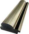
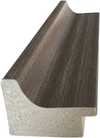
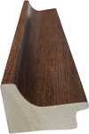
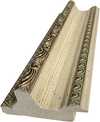
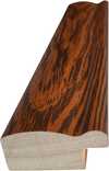
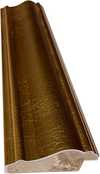
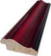
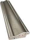
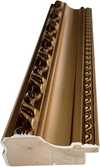
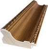
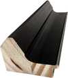
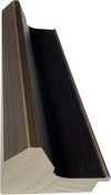
Izaberite jednu od naših unapred definisanih veličina koje odgovaraju originalnim proporcijama umetničkog dela.

Možete uneti sopstvene dimenzije kako biste umetničko delo prilagodili specifičnom okviru ili prostoru. Ako odabrani format ne odgovara proporcijama originalne slike, mi ćemo ili iscrtati deo dela ili proširiti sliku pomoću ogledane ivice ili jednobojnog popunjavanja. Digitalni prikaz će vam biti poslat na odobrenje pre početka proizvodnje.
Imajte na umu da pregled na ekranu ne odražava stvarno iscrtavanje ili proširivanje. Samo će prikaz (mockup) precizno pokazati finalnu kompoziciju.
Iako su prilagođene dimenzije dostupne, preporučujemo da odaberete dimenziju sa unapred definisane liste kako biste očuvali originalne proporcije.
Dostava širom sveta () za 2 nedelje umesto uobičajenih 4/5 nedelja. (14 август)


Counter composition XV
Dimenzije reprodukcije
Theo van Doesburg's "Counter Composition XV," painted in 1925, isn’t merely a painting; it’s a distilled essence of the De Stijl movement – a radical declaration of order and universal harmony. This deceptively simple work, executed against a stark white canvas, pulsates with an underlying tension born from the careful orchestration of geometric forms and primary colors. It represents a pivotal moment in 20th-century art, moving beyond representational imagery to explore the very foundations of visual language itself. The piece immediately commands attention not through elaborate detail or narrative, but through its profound sense of balance and its unwavering commitment to abstraction.
At first glance, the composition appears austere – a red rectangle dominating the upper left quadrant, juxtaposed with a blue counterpart in the lower right. However, this initial impression quickly gives way to an appreciation for the intricate grid that underpins the entire work. A network of black and white squares, meticulously arranged, creates a dynamic interplay of movement and stillness, suggesting both order and potential disruption. This isn’t haphazard placement; it's a deliberate choreography designed to evoke a feeling of controlled dynamism – a visual embodiment of De Stijl’s core philosophy.
The brilliance of "Counter Composition XV" lies in its reduction. Van Doesburg stripped away all extraneous elements, leaving only the fundamental building blocks of form and color: red, yellow, blue, black, and white. This limited palette wasn’t chosen arbitrarily; each hue was selected for its inherent purity and intensity, intended to be experienced without distraction. The application is equally crucial – flat, unmodulated areas devoid of shading or blending. This technique emphasizes the geometric shapes themselves, highlighting their sharp edges and creating a sense of crystalline clarity. It's a testament to the artist’s belief that beauty could be found in simplicity and precision.
The absence of perspective is equally significant. Van Doesburg deliberately rejects traditional spatial representation, opting instead for a two-dimensional plane where shapes are presented as independent entities. Overlapping elements and variations in size subtly suggest depth, but the overall effect is one of flattened planes interacting within a carefully constructed framework. This approach reflects De Stijl’s rejection of illusionism and its embrace of a purely conceptual understanding of space.
Beyond its formal qualities, "Counter Composition XV" carries profound symbolic weight. The geometric forms – rectangles, squares, lines – are not merely decorative; they represent fundamental principles of order, balance, and harmony. The primary colors, stripped of their associations with natural phenomena, become pure expressions of energy and vibration. Van Doesburg believed that through the rigorous application of these abstract elements, artists could create a visual language capable of transcending individual expression and communicating universal truths. The piece is an attempt to build a new aesthetic based on mathematical ratios and geometric relationships – a blueprint for a harmonious world reflected in art.
Theo van Doesburg’s “Counter Composition XV” stands as a powerful testament to the transformative potential of abstraction. It's more than just a painting; it’s an invitation to contemplate the underlying order of the universe and the possibility of creating beauty through pure geometric form. Its stark simplicity, combined with its profound symbolic depth, continues to resonate with viewers today, cementing its place as a cornerstone of modern art.


1883 - 1931
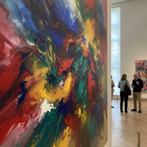
Explore the profound emotional depth of Lyrical Abstraction. Discover how masters like Raymond Parker used color and form to bridge Impressionism and Abstract Expressionism. Learn about this pivotal movement through our expert-led art history guide.


Budite u toku sa najnovijim vestima o umetnosti, ekskluzivnim ponudama i idejama za dekoraciju.
Recite nam o vašem projektu i naši stručnjaci za umetnost će vam pružiti 3 personalizovana predloga umetničkih dela.
Dozvolite nam da odaberemo 3 opcije specijalno za Vas - Besplatno!


 Pregledaj u prostoru
 Pošalji
 Podeli
 Detalji o delu

 Преузми
 Slični predmeti
 Rendgenski snimak
 Slajdovi

 Pročitaj više
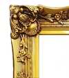
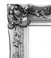
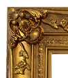
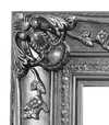
 Opcija sa staklom dostupna je samo za dimenzije manje od 110 cm


