x

 Sdílet
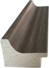
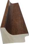
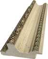
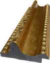
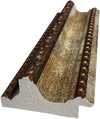
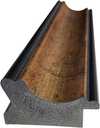
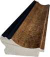
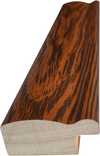
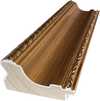
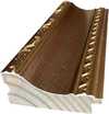
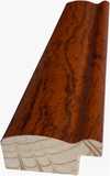
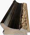
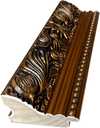
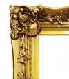
Giclée nebo plátěný tisk muzeální kvality s rychlou výrobou a flexibilními možnostmi povrchové úpravy.
Vyberte si z našich přednastavených velikostí, které odpovídají původním proporcím díla.
Můžete zadat vlastní rozměry tak, aby výtvor odpovídal konkrétnímu rámu nebo prostoru. Pokud zvolená velikost nebude odpovídat poměru stran původního obrazu, dílo buď ořížeme, nebo obraz rozšíříme pomocí zrcadlového efektu či jednobarevného okraje. Před zahájením výroby vám bude zaslán digitální náhled k schválení.
Mějte prosím na paměti, že náhled na obrazovce neodráží skutečné oříznutí nebo rozšíření. Pouze digitální náhled přesně zobrazí finální kompozici.
Ačkoliv jsou k dispozici i vlastní rozměry, pro zachování původních proporcí doporučujeme vybrat si rozměr z předdefinovaného seznamu.
Celosvětové doručení () do 2 týdnů namísto standardních 4/5 týdnů. (27 červenec)


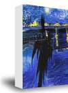
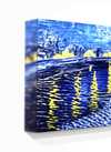
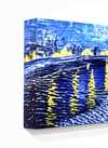
Variant/Adobe
Rozměry reprodukce
Josef Albers’ “Variant/Adobe,” created in 1948, is a captivating example of his renowned “Homage to the Square” series. This artwork isn't merely a composition; it's an exploration of color theory and perceptual phenomena, inviting viewers to contemplate how colors interact and influence one another. The piece exemplifies Albers’ commitment to understanding and demonstrating the relativity of color perception—how a color appears can be dramatically altered by its surrounding hues.
The artwork's structure is based on a precise geometric framework. A dominant red rectangle sits at the center, partially veiled by a slightly smaller brown rectangle positioned above it. These central forms are framed by horizontal bands of pink at the top and gold/yellow at the bottom, creating a layered effect. Two symmetrically placed vertical rectangles in a lighter pink shade further define the central area. The consistent use of straight lines emphasizes the artwork’s geometric precision and reinforces its sense of order. This deliberate arrangement isn't arbitrary; it's designed to create visual tension and harmony simultaneously.
Albers employs a restrained yet impactful color palette, primarily featuring shades of red, brown, pink, and yellow/gold. The colors are presented in their purest form—flat and unmodulated—avoiding gradients or shading techniques. This deliberate choice highlights the inherent qualities of each color and allows for a direct examination of their interaction. The technique itself is characterized by careful control; the paint appears to be applied evenly across the canvas, suggesting meticulous attention to detail and a desire to minimize textural variation. There's no visible brushwork or impasto, further emphasizing the flatness and clarity of the composition.
“Variant/Adobe” emerged from Albers’ time at Black Mountain College in the late 1940s, a period marked by experimentation and innovation in abstract art. The "Homage to the Square" series, to which this work belongs, was Albers' extended investigation into color relationships within a consistent geometric framework—the square. Symbolically, the artwork can be interpreted as representing patterns found in nature or reflecting the complexities of human perception. The repetition and variation of shapes suggest an underlying order while simultaneously acknowledging the subjective nature of visual experience. It aligns with principles of Minimalism and Concrete Art, prioritizing objective forms and emphasizing a reduction to essential elements.
Despite its abstract nature, “Variant/Adobe” evokes a sense of calm, precision, and visual harmony. The carefully balanced composition and the deliberate color choices create a feeling of equilibrium. The artwork’s enduring appeal lies in its ability to engage viewers on both an intellectual and emotional level—it's a testament to Albers’ profound understanding of color theory and his skill in translating complex ideas into visually compelling forms.


1888 - 1976 , Německo

Objevte sílu minimalismu v umění! Prozkoumejte top 10 děl od Rothka, Maleviče a dalších. Inspirujte se jednoduchostí barev a tvarů pro váš interiér. Reprodukce obrazů nejvyšší kvality na Most-Famous-Paintings.com.

Explore Josef Albers's groundbreaking color theory & the 'Homage to the Square' series. Discover how his work revolutionized visual perception and influenced modern art movements like Minimalism & Op Art. Learn about his Bauhaus roots & lasting legacy.

Explore the evolution of geometric abstraction from Cubism to contemporary art. Discover key artists like Malevich & Mondrian, investment insights, and expert collecting advice at Most-Famous-Paintings.

Explore the captivating world of Color Field painting! Discover its origins, key artists like Rothko & Newman, philosophical depth, and lasting influence on modern art. Expert insights for collectors.

Prozkoumejte vliv osvětlení na percepční posuny v současné abstraktní malbě. Historický kontext, analýza děl Gerharda Richtera a moderních technik luminiscence. Pro sběratele a znalce umění.


Buďte na tahu s nejnovějšími novinkami ze světa umění, exkluzivními nabídkami a inspirativními nápady na dekoraci.
Sdělte nám více o svém projektu a naši odborníci na umění vám připraví 3 personalizované návrhy uměleckých děl.
Nechť pro vás vybereme 3 možnosti – zdarma!


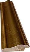
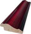
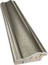
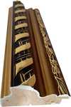
 Skleněná varianta je dostupná pouze u rozměrů menších než 110 cm


